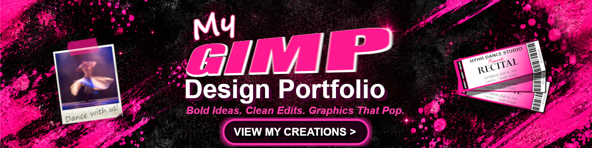
Made in GIMP. Built to be seen.
This portfolio is where class projects started looking less like assignments and more like design work. I used GIMP to experiment with typography, badges, icons, buttons, animation, and banners while learning how color, contrast, spacing, layering, and motion can completely change the mood of a graphic.
Some pieces are polished, some are loud on purpose, and a few taught me what I want to do differently next time. The gallery brings those projects together in one place so you can see both the work and the progress behind it.
Bold ideas. Clean edits. Graphics that pop.
Six ways to make pixels work harder.
Type that refuses to whisper.
Text Effects
Typography experiments, stylized lettering, and text treatments created in GIMP.
View Text Effects
Small format. Big identity.
Badges
Compact designs built around shape, hierarchy, contrast, and branding.
View Badges
Tiny graphics. Clear ideas.
Icons
Small graphics that use framing, imagery, and recognizable visual cues.
View Icons
Go ahead. Click it.
Buttons
Call-to-action graphics using gradients, borders, images, and strong type.
View Buttons
Still was getting boring.
Animation Effects
Animated GIMP projects that add movement and timing to visual design.
View Animations
Big space. Bigger message.
Banners
Wide-format graphics designed to communicate quickly and scale responsively.
View Banners